Often, we find ourselves in situations where we need to create color palettes or select one or more colors to pair together. We end up wasting a lot of time experimenting until we find what truly convinces us. This is because not all of us possess the wisdom of Joseph Albers and his mastery of color theory and interaction.
However, just like in many other fields (such as 100+ online tools for architects and designers), there are tools specifically designed to create beautiful color palettes and inspire creativity.
You can extract colors from a photo of your choice or choose from color palettes already tested by other designers. The ways to create them are numerous, and by using these tools, you’ll have a wide range of color palettes to choose from.
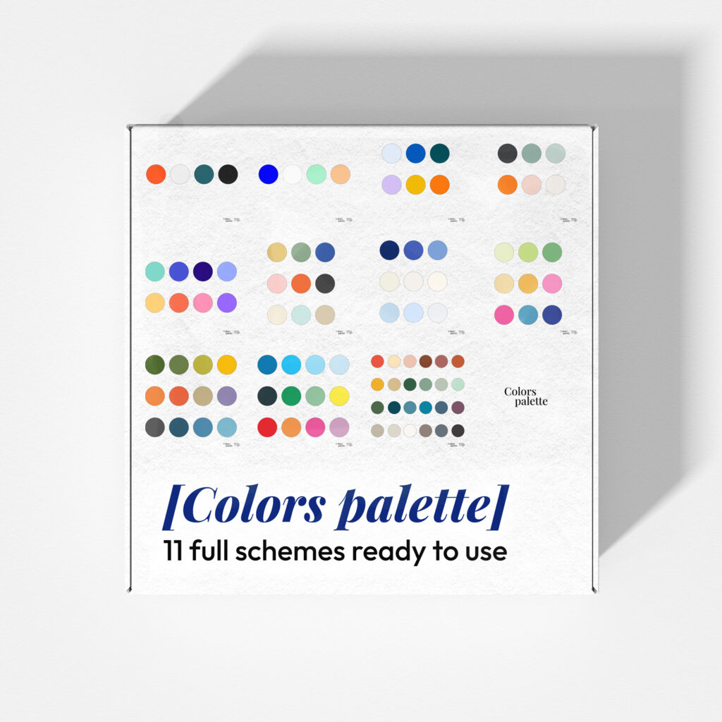
Before we begin, speaking of pre-tested color palettes, I’d like to point out this free resource available on Mfa’s shop. It’s a kit of color palettes designed specifically for architectural schemes and diagrams. I’ve used some of these in competitions I’ve participated in. Of course, these colors can also be used for presentations or specific graphics on social media.
The best websites to find color palettes generators
Below are some selected websites that provide the best tools available online to find the perfect color schemes for your creations or your corporate image.
Colordot
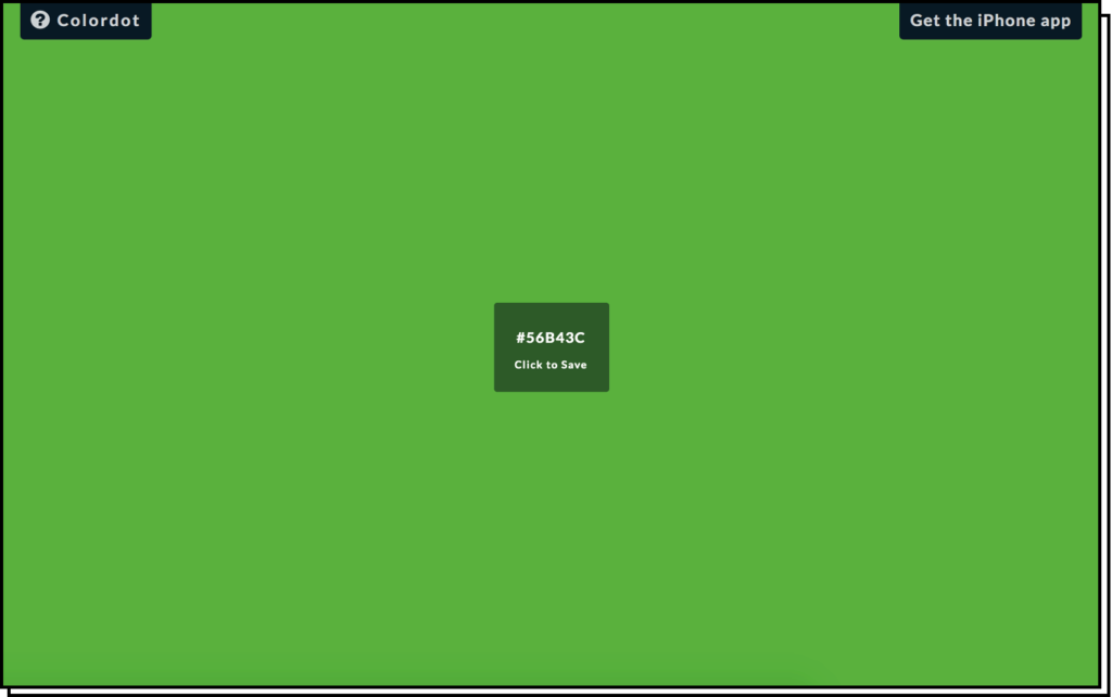
Hover your mouse over the screen on Colordot, and you’ll see the entire page’s color change in real-time. Once you find the right one, simply click to copy its code. Very convenient, although you can choose only one color at a time in this case.
Adobe Color
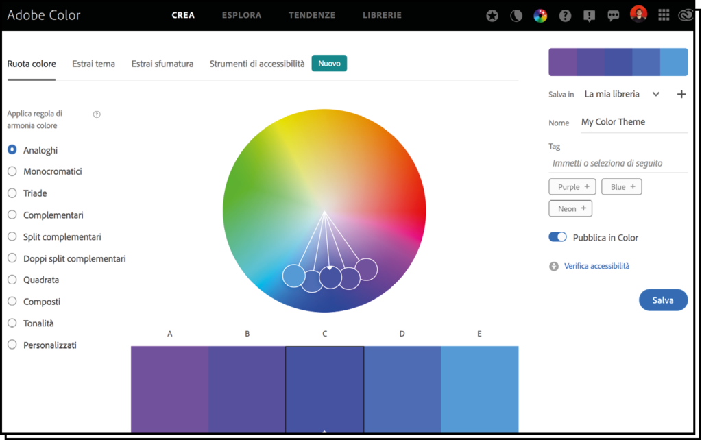
An online tool from Adobe that’s highly intuitive and extremely useful when searching for custom color palettes based on specific colors. Once you’ve got your colors, you can further modify them individually.
Colormind
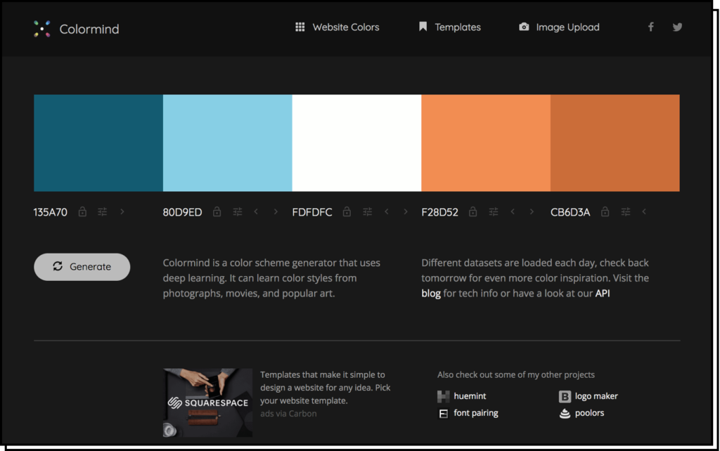
A simple random palette generator. Useful if you’re starting from scratch and have limited time.
Coolors
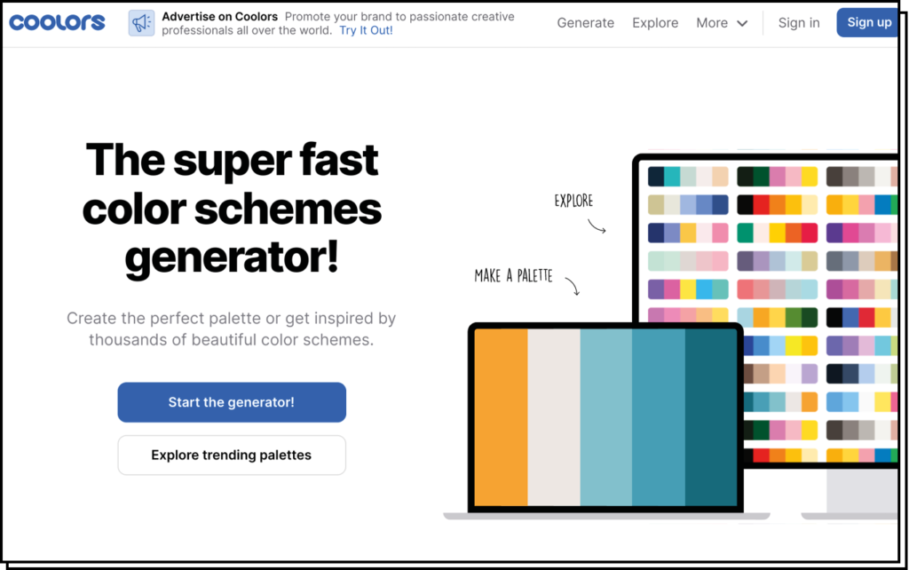
Another color palette generator. This tool is more refined and allows for various degrees of customization and modification. Useful if you want to be inspired while still maintaining a certain degree of color creation freedom.
Canva Palette Generator
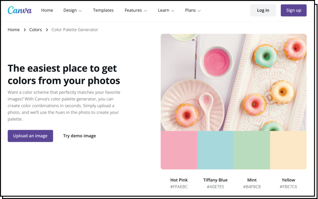
As with everything else on the platform, Canva lets you do a bit of everything. Here you can both find inspiration from ready-to-use color palettes and upload an image to let the system derive a relevant color palette from it.
Colorhunt
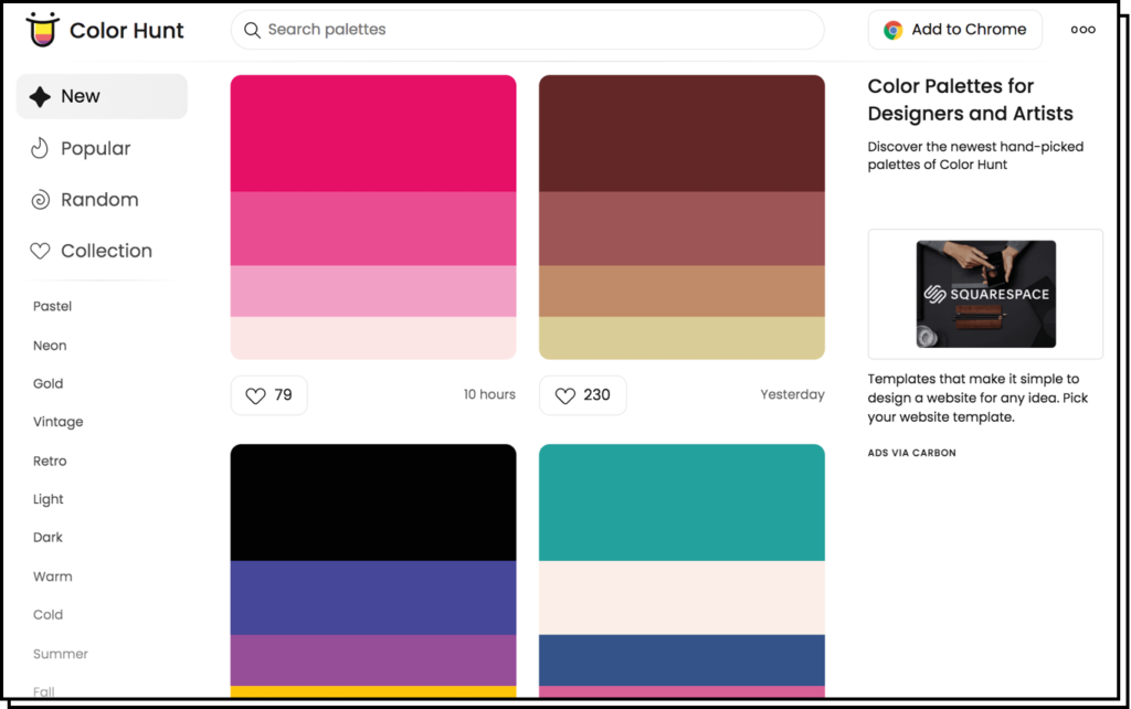
Colorhunt is honestly one of my favorites. Despite its “limitations” compared to others, it’s extremely fast and intuitive to use, providing a vast number of color palettes to draw inspiration from.
Other very interesting sites to find inspiration for color palettes and more:
The best apps for creating color palettes
In addition to the websites listed above, there are also apps available for those who work directly on smartphones or need to be more flexible.
Here are some free apps where you can create color palettes, even starting from your own photos. These palettes can then be used in your creations or for any other purpose like presentations, cards, illustrations, etc.
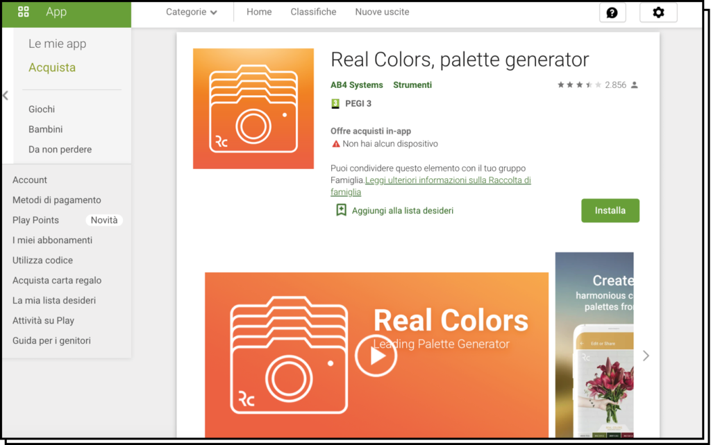
Real Colors
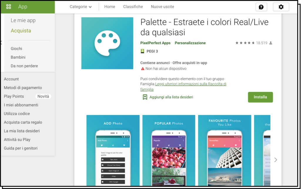
Palette
(Android)
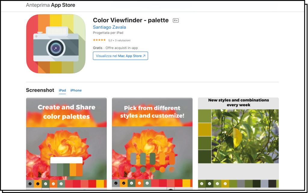
Color Viewfinder
(iOS)
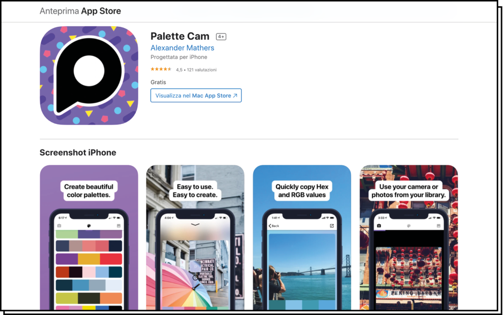
Palette Cam
(iOS)
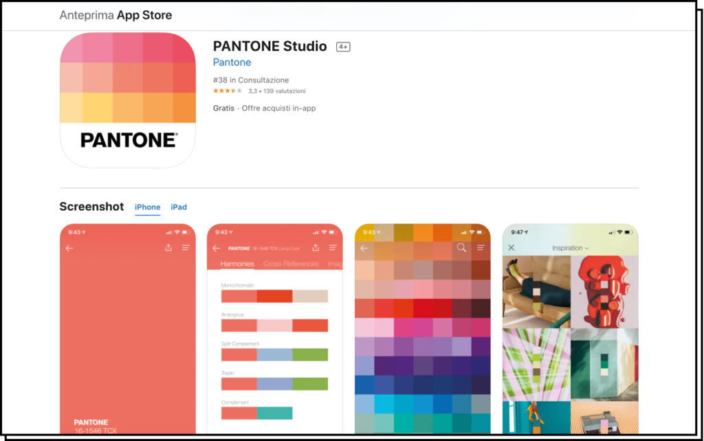
Pantone Studio
(iOS)
With these tools, we now know how to create new colors, pair them, and create beautiful palettes to use in our graphics, presentations, or projects.
However, sometimes we set up our work in a certain way, and then when it comes to printing, it doesn’t turn out as expected. This is due to the color model. Let me briefly introduce this concept to you now.
Avoiding Color Surprises and mistakes
Whether you’re importing an existing color palette or creating a new one, establishing the color model upfront is crucial to avoid surprises and achieve the right chromatic rendering of the chosen colors.
As you may know, the two main color models are RGB and CMYK. But how do you choose the most suitable one for what you’re doing? It’s simple. Just consider how your work will be used. If the graphics are for the web or video, choose RGB; if it’s for printing, opt for CMYK.
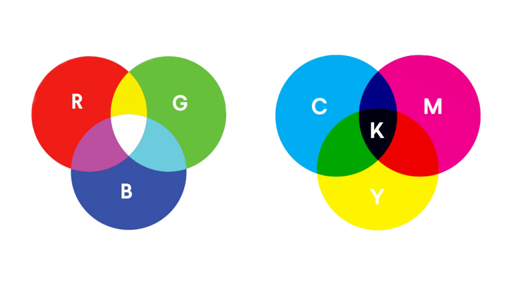
The RGB Color Model
R stands for Red, G for Green, and B for Blue. In this case, all colors come from the combination of these three, including white (resulting from the sum of the three) and black (resulting from their absence).
The RGB color model is suitable for web/video because practically all screen types use this method. Therefore, what we design on the screen (in Illustrator, Photoshop, etc.) will look exactly the same on another screen once we export our file with its respective color palette.
The CMYK Color Model
The CMYK model is a subtractive color method, meaning color definition is achieved by adjusting each color’s brightness.
This method is called quadrichromy because it comprises four colors: Cyan, Magenta, Yellow, and Black. In this case, black is added because the sum of the first three CMY colors creates brown.
The CMYK method is suitable for printing because most printers use it.
How to Change the Color Model in an Existing File?
- In Photoshop, go to Image > Mode > Choose
- In Illustrator, go to File > Document Color Mode > Choose
Note that RGB has brighter and more vibrant colors, while CMYK has a softer appearance. Therefore, whenever the print looked different from what you saw on screen, it was simply due to a conversion from RGB to CMYK.
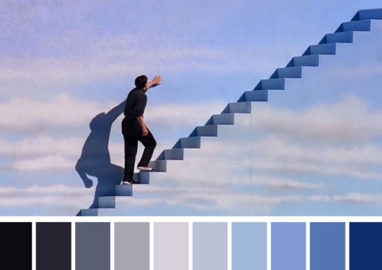
Before I wrap up, since we’re on the topic, I’d like to mention @cinemapalletes, a fantastic Instagram account that creates color palettes inspired by famous film stills. I had written about this on Objects some time ago.
If you were looking for an online tool to create a color palette, I’m sure you’ll be satisfied with reading this post. Feel free to comment if you know of another tool or if you have any other questions!


